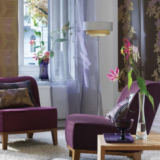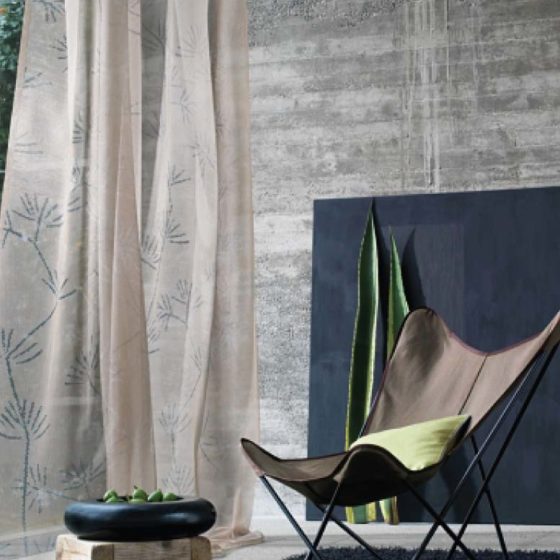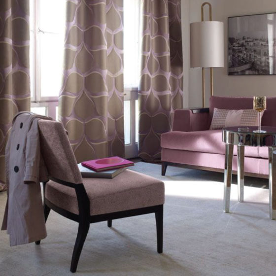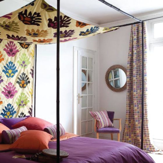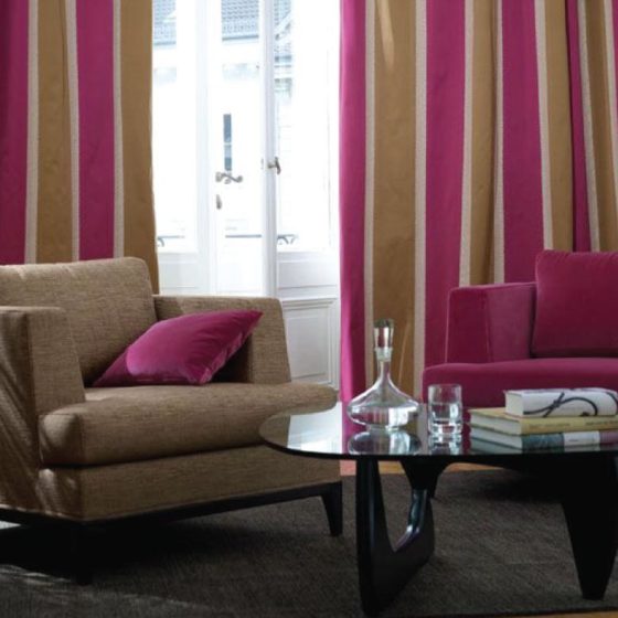
There are no bad colours, just bad combinations! Colour is a crucial element of interior design. The right choice of colour helps us relax, work and rejoice, while no colour or a wrong choice of colour can lead to disarray, anxiety, nervousness, restlessness, even fatigue.
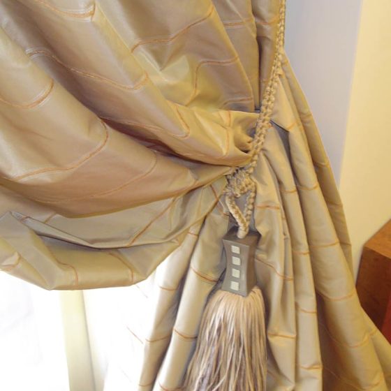
Fabrics are one of the best and easiest ways to decorate and refresh a room. Texture, colours and patterns can add a touch of character to your space. The feelings evoked by colour also depend on the texture of the fabric. There are three main types of texture: matte, satin and shiny. More generally, you can dare to choose shiny, velvety or even metallic colours for your fabrics to add shine and elegance to your space.
Before choosing the colours of the fabrics for your space, you should reflect on the ambience you would like to create. Would you like it to be serene or full of energy? The colours used in fabrics fall under two categories: Warm and Cool Colours. Colour is associated with light. When selecting your desired hue, you should consider the effect on it of both natural light and artificial light.
It is true that many people are not keen on dropping some colour in their spaces; they think it can easily become outdated. This is why playing with the different colours of fabrics is a good compromise; they are easy to change and give lots of room for renewal. But you have to bear in mind that texture and colour must be selected according to season. You can easily have two sets of covers for pillows and sofas and change according to the season of the year. Drapes in different colours are also a good solution. A wide variety of threads and designs can be found on the market, which is why the fabric is the most flexible means of introducing texture and colour. For sofas, it is advisable to select fabrics that are specially treated to be easily cleaned with water. The most dominant fabric, which is usually the sofa upholstering, should be repeated at least 3 times in different places in your space, e.g. an armchair and some pillows, to be given weight. The combination of a simple fabric with another fabric, which is embossed or has a different type of weave, is also quite interesting. For example, silk with cotton.
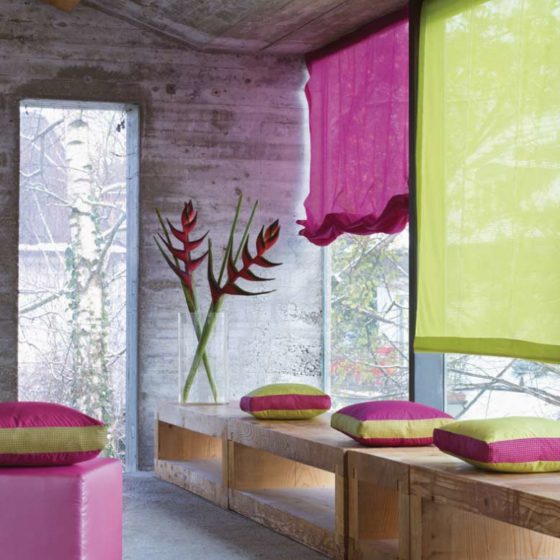
It is very important that colours do not appear to the same degree in space. The use of several colours in large quantities will cause permanent confusion and irritation. For a quiet, elegant and sophisticated style, you only need one dominant colour and all the others should be used sparingly. Intermediate tones tie in with one another on an equal footing and can offer balance and a sense of peace. By choosing fabrics with soft colours from natural materials, you lend your spaces the magic of white, which allows us to view shapes and forms from a different perspective. A classic choice is the use of hues with a medium tone (these are colours that go well together and have the potential to create a peaceful and balanced decor). For the ardent supporters of minimal, there is always the solution of linear patterns or combinations with just two colours and a small dosage of colour intensity. Black and white are a safe choice in the world of design and they lend themselves to be used as a serious and civilized alternative. Sometimes, “high aesthetics” are achieved by a weak colour. However, we very often see top designers and product manufacturers (fabrics-tapestries) using bright colours for indoor environments. As a more general trend, we see a clear increase in the use of colour in the world of design. A neutral, slightly metallic wallpaper on the walls can enhance the sense of luxury. But be careful! it is a myth that wallpaper helps cover defective surfaces. On the contrary, wallpaper can only be Installed over smooth skim coated walls.
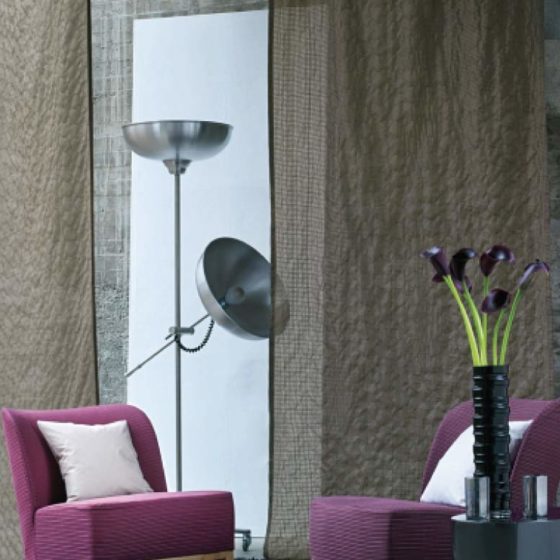
A versatile space…White, sand and grey are neutral colours and can be applied to the building elements of your space to give you the flexibility of a quick renewal just by using a variety of fabrics interchangeably.
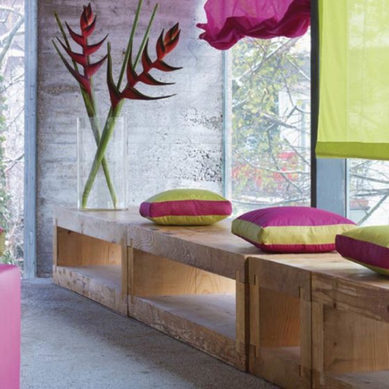
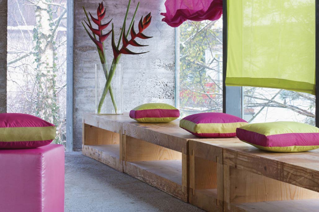
Photos are from the Cripe collection of fabrics

